
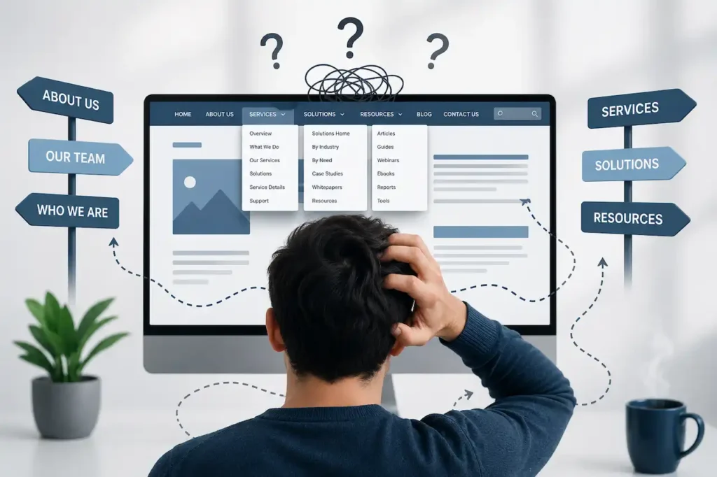
Website navigation plays a much bigger role in the customer journey than many businesses realize. When visitors arrive on a website, they need to understand where they are, what the business offers, and where they should go next. If the navigation is unclear, overloaded, inconsistent, or difficult to use, visitors may struggle to find important information and leave before taking the action you want.
A website can have excellent design, strong content, attractive images, and valuable services, but poor navigation can undermine all of those elements. Visitors should not have to guess which menu item contains a service, search through multiple pages to find contact information, or repeatedly return to the homepage because they cannot figure out where they are.
Confusing navigation can also affect more than user experience. It can make important pages harder to discover, create unnecessary friction in the conversion process, and make it more difficult for search engines to understand the relationship between different pages. For businesses that depend on their website for leads, sales, bookings, or customer inquiries, navigation should be treated as part of the overall website strategy rather than simply a design element.
What Makes Website Navigation Confusing?
Website navigation becomes confusing when visitors cannot quickly understand how information is organized or where they should go next. The problem may be caused by too many menu items, unclear labels, complicated dropdowns, inconsistent navigation, poor mobile usability, or pages that are buried several clicks deep.
Sometimes the problem is not obvious to the business owner because the website makes perfect sense to the people who built it. Employees and developers already understand the company’s services, terminology, and internal structure. A first-time visitor does not have that same context.
For example, a business might use a menu label such as “Solutions” because it sounds professional and fits the brand. However, a visitor may not immediately understand whether that section contains services, products, industries, or resources. A clearer label such as “Services” may communicate the purpose more directly.
Good navigation should reduce the amount of thinking required from the visitor. People should be able to recognize where they need to go without having to understand how the business internally organizes its information.
Why Do Visitors Need Simple Website Navigation?

Visitors generally come to a website with a specific goal. They may want to learn about a service, compare products, check pricing, read reviews, contact the business, schedule an appointment, or find answers to a question.
If navigation helps them reach that information quickly, the website feels easy to use. If navigation creates obstacles, visitors may become frustrated or abandon the website.
This is particularly important for first-time visitors. They do not know which pages exist, how your services are structured, or what terminology your company uses. The navigation needs to guide them without requiring them to learn the website first.
Simple navigation also makes the website easier to scan. Instead of presenting visitors with a large number of choices, it highlights the pages and actions that matter most.
The objective is not necessarily to make every page accessible from the main menu. It is to make the most important information easy to find while maintaining a logical structure for everything else.
Is Your Main Menu Too Crowded?
One of the most common navigation problems is an overloaded main menu. Businesses often try to include every important page because they want visitors to have immediate access to everything.
The result can be a menu containing services, industries, locations, resources, company information, tools, blogs, case studies, contact options, and several other categories.
While this may appear comprehensive, it can make the menu difficult to scan. When visitors see too many choices at once, they may not know which option is most relevant to their needs.
A better approach is to identify the primary actions and information visitors are most likely to need. Secondary content can be organized inside dropdowns, resource sections, footer navigation, or contextual links within the website.
The main navigation should provide a clear overview of the website rather than becoming a complete sitemap.
Are Your Navigation Labels Clear?
Navigation labels should tell visitors what they will find after clicking them. If a label is vague, clever, overly technical, or based on internal company terminology, visitors may hesitate to select it.
Labels such as “Solutions,” “Capabilities,” “Explore,” or “Discover” may work for some brands, but they can also create uncertainty. If the goal is to help users find services, “Services” is often easier to understand.
Clear labels do not have to be boring. They simply need to communicate meaning quickly.
Consider the difference between “Our Expertise” and “Web Development Services.” The first sounds polished but leaves room for interpretation. The second immediately tells the visitor what the page contains.
When reviewing navigation, ask someone unfamiliar with your business to look at the menu and explain what they think each option means. Their reaction can reveal confusion that your internal team may not notice.
Does Your Navigation Match Customer Intent?
Your website structure should reflect how customers think about your business rather than only how your company organizes its internal departments.
For example, a customer looking for help with a website redesign may expect to find a page called “Website Redesign.” They are less likely to search for an internal category such as “Digital Transformation Solutions.”
This is where customer intent becomes important.
Think about the questions visitors ask before contacting your business. What services are they searching for? What problems are they trying to solve? What information do they need before making a decision?
Your navigation should make those paths obvious.
A customer-focused navigation structure often performs better because it uses language and categories that match what visitors actually need.
Are Important Pages Buried Too Deep?
A page can technically exist on your website while still being difficult to find. If visitors have to click through several layers of menus before reaching an important service or contact page, the navigation may be too deep.
Important commercial pages should generally be easy to discover from relevant parts of the website. Visitors should not have to start at the homepage and navigate through multiple unrelated categories.
For example, if you offer several website development services, a visitor should be able to reach those services from the main navigation or from a relevant service category without going through multiple unnecessary steps.
The same principle applies to important informational pages. If customers frequently ask about pricing, process, locations, or support, those areas should be easy to access.
The goal is not to minimize every website to two clicks. It is to avoid unnecessary navigation steps that do not provide meaningful value.
How Does Navigation Affect User Experience?
Navigation is one of the primary ways visitors understand a website. It tells them what the business offers, how information is organized, and where they can go next.
When navigation is predictable and consistent, visitors can move through the website with less effort. They can explore different pages without constantly wondering whether they are in the right place.
Confusing navigation creates friction. Visitors may click the wrong links, open unnecessary pages, return to previous pages, or abandon the website altogether.
This becomes especially problematic on websites with complex services or large product catalogs. The more information a website contains, the more important it becomes to create a clear hierarchy.
Good navigation acts like a map. It helps visitors understand where they are and where they can go without forcing them to figure out the structure themselves.
Are You Using Too Many Dropdown Menus?
Dropdown menus can be useful when a website has multiple related pages, but large or complicated dropdowns can create their own problems.
A dropdown containing dozens of links may technically provide access to many pages, but it can be difficult to scan. On desktop devices, visitors may accidentally move their cursor away from the menu and close it before selecting an option.
Deeply nested dropdowns can be even more confusing. A visitor may have to hover over one category, then another submenu, and then another option before reaching the desired page.
Instead of using dropdowns to expose every page, use them to organize closely related content. Group similar pages under clear categories and avoid unnecessary levels.
The navigation should make relationships between pages easier to understand, not turn the menu into a miniature database.
Does Your Mobile Navigation Work Properly?
A website navigation system that works well on desktop may become difficult to use on mobile devices. Mobile visitors have less screen space, and navigation is often hidden behind a menu button.
This makes the organization of the mobile menu particularly important.
Visitors should be able to open the menu easily, understand the available categories, expand sections without confusion, and reach important pages without excessive scrolling.
Buttons and links should also be large enough to interact with comfortably. Small navigation elements can lead to accidental clicks and frustration.
Review your mobile navigation separately from your desktop navigation. Do not assume that a responsive design automatically produces a good mobile experience.
A responsive website design should adapt to different screen sizes, but navigation still needs to be intentionally structured and tested for smaller screens.
Are Your Navigation Elements Consistent?
Consistency helps visitors build a mental model of your website. If the main menu appears in one location on one page and behaves differently on another, visitors may become confused. The same applies to labels, dropdown behavior, button styles, breadcrumbs, and other navigation elements.
For example, if one page calls a section “Services” while another calls the same category “Solutions,” visitors may wonder whether these are two different areas.
Consistency does not mean every page must look identical. It means important navigation patterns should behave predictably throughout the website. Visitors should not have to relearn how your navigation works every time they open a new page.
Can Visitors Easily Find Your Contact Information?
Contact information is often one of the most important conversion elements on a business website. Yet some websites make it surprisingly difficult to find.
If a visitor is ready to ask a question, request a quote, schedule a consultation, or start a project, they should not have to search through multiple pages to find a way to contact the business.
A clear contact option should generally be available from the main navigation or another consistent location. The footer can also provide important contact information and links.
The exact placement depends on the business, but the principle is simple: when visitors are ready to take action, the website should make that action easy to find.
Are You Relying Only on the Main Menu?
The main navigation is important, but it should not be the only way visitors discover pages.
Contextual internal links can guide visitors from one relevant page to another based on what they are currently reading. For example, a blog about website performance can naturally link to a website speed optimization service when that service provides a relevant next step.
This creates a more natural customer journey because visitors discover information within the context of what they are already interested in.
Footer links, breadcrumbs, related content, calls to action, and search functionality can also support navigation.
A strong website does not force visitors to return to the main menu every time they want to explore another related topic.
How Does Internal Linking Support Navigation?
Internal linking helps connect related pages and gives visitors additional paths through your website.
Suppose a visitor reads an article about website redesign. A relevant internal link can guide them to your website redesign services if they are interested in getting professional help.
Similarly, a visitor researching WordPress may benefit from a contextual link to WordPress development or a related service page. These links should be natural and relevant. The goal is not to add links simply for SEO. Internal links should help visitors continue their journey and discover information that answers their next question.
A well-connected website can therefore have a relatively simple main menu while still providing access to a large amount of useful information. This approach is especially useful when connecting informational content with landing pages and conversion opportunities.
Is Your Website Navigation Helping or Hurting SEO?
Navigation can also influence how search engines discover and understand pages on your website.
Search engines use links to discover content and understand relationships between pages. A logical website structure can make it easier for important pages to be crawled and associated with relevant topics.
Poor navigation can create orphaned pages, excessive click depth, duplicate pathways, or weak connections between related content.
This does not mean navigation should be designed only for search engines. User experience should remain the priority. However, a clear structure often benefits both users and search engines.
If you are restructuring navigation during a redesign, consider how the new structure affects existing URLs, internal links, breadcrumbs, and important landing pages.
Can Poor Navigation Hurt Conversions?
Yes. Confusing navigation can create friction at important points in the customer journey.
Imagine a visitor arrives on your website through a service page. They are interested in the service but have questions about pricing, process, experience, or previous work. If they cannot easily find those answers, they may leave instead of continuing toward a conversion.
The same problem can occur on ecommerce websites. Customers may struggle to find categories, filters, product information, shipping details, or the cart.
A conversion-focused navigation system does not need to push visitors aggressively toward a sale. It simply needs to make relevant information and next steps easy to find. This is an important part of conversion rate optimization because reducing unnecessary friction can make it easier for interested visitors to take action.
How Can You Organize Navigation for a Growing Website?

Website navigation often becomes confusing because businesses continue adding pages without revisiting the overall structure.
A company may start with five services and eventually expand to twenty. New locations, industries, resources, tools, case studies, and content are added over time. If each new page is simply added to the existing navigation, the menu can quickly become overloaded.
Growing websites need periodic restructuring.
Start by grouping related pages into logical categories. Determine which pages deserve primary navigation placement and which can be accessed through secondary navigation or contextual links.
You should also review whether some pages overlap or provide little value. Removing or consolidating unnecessary content can make the overall structure easier to manage.
A scalable website structure should allow the business to grow without requiring the main menu to grow endlessly. A clear lead generation website structure can also help organize important service pages and guide visitors toward relevant conversion points.
Should You Include Every Service in the Main Navigation?
Not necessarily. Businesses often want every service to appear in the main menu because each service is important to them. However, visitors do not necessarily need to see every option immediately.
If you offer many services, consider creating a clear parent category such as “Services” and organizing related offerings within it. Individual service pages can then link to one another where relevant.
The best structure depends on the size and complexity of the website, but the main principle is to prioritize clarity over completeness. Your navigation should help visitors understand what your business does without overwhelming them with every possible option.
How Can Breadcrumbs Improve Navigation?

Breadcrumbs can be particularly useful for websites with multiple levels of content. They show visitors where the current page sits within the overall website structure. For example, a visitor might see a path such as Home > Services > Web Development > Shopify Development.
This gives the visitor context and provides another way to move back to a broader category.
Breadcrumbs can be especially useful for ecommerce stores, service websites with many categories, and large content libraries. They should not replace the main navigation, but they can provide additional orientation for visitors who have moved deeper into the website.
Is Your Website Search Helping Visitors?
Internal search can be valuable for websites with large amounts of content, products, or resources. However, search should support navigation rather than compensate for a confusing structure. If visitors constantly need to use search just to find basic information, the navigation may need improvement.
Search functionality is particularly useful for ecommerce stores with large product catalogs. Customers may know exactly what they want and prefer searching rather than browsing multiple categories. The best approach depends on your website. Use navigation for broad discovery and search for visitors who already have a specific destination in mind.
How Can You Test Whether Your Navigation Is Confusing?
One of the easiest ways to test navigation is to watch someone unfamiliar with your website use it.
Give the person a few simple tasks without explaining where to find the information. For example, ask them to find a specific service, locate pricing information, contact the business, find a particular product, or locate a case study. Watch where they click and where they hesitate.
If multiple people struggle with the same task, that is a strong indication that the navigation or page structure needs improvement. You can also use website analytics to identify pages where visitors frequently leave, navigation paths that do not lead to conversions, and other behavioral patterns. These insights can help you determine whether visitors are finding the information they need.
How Can You Simplify Your Website Navigation?
Start by identifying the most important goals visitors have when they arrive on your website. Then make those paths easy to access. Remove menu items that are unnecessary or rarely used. Combine related categories where appropriate and replace vague labels with clear descriptions.
Keep the main menu focused on the most important sections and use contextual links, footer navigation, breadcrumbs, and other elements to connect secondary pages. Most importantly, review the navigation from the perspective of a first-time visitor. If the structure is difficult to understand, website improvement services can help address navigation, structure, usability, and other website issues. Ask whether someone who knows nothing about your company could understand the structure within a few seconds.
If the answer is no, the navigation probably needs simplification.
When Should You Redesign Your Website Navigation?
You should consider reviewing your navigation when the website has grown significantly, when users struggle to find important information, or when your business has changed its services or structure.
Navigation should also be reviewed during a major website redesign. A redesign is an opportunity to improve the information architecture rather than simply changing colors, layouts, and images.
If your current website has accumulated years of content and pages, a website redesign can provide an opportunity to rethink the structure around current customer needs.
However, navigation improvements do not always require a complete redesign. Sometimes reorganizing menus, simplifying labels, improving internal links, or changing page hierarchy can solve the problem.
Final Thoughts
Confusing website navigation can make it harder for potential customers to find information, understand your services, and take the next step. The problem is often caused by an overloaded menu, unclear labels, complicated dropdowns, buried pages, inconsistent navigation, or a mobile experience that has not been properly considered.
Start by looking at your website from the perspective of someone who has never used it before. Can they quickly understand what your business offers? Can they find your most important services? Can they locate contact information without searching? Can they move from one relevant page to another without repeatedly returning to the homepage?
Simplify the main navigation, use clear labels, organize related pages logically, and use internal links to create natural paths between relevant content. Make sure your mobile navigation works just as well as your desktop navigation, and use breadcrumbs or search when they genuinely help visitors navigate deeper sections of the website.
Good navigation is not about giving visitors more choices. It is about helping them make the right choice with less effort.
When your website structure reflects customer needs, visitors can find information faster, explore relevant services more naturally, and move toward conversion without unnecessary friction. At the same time, a logical structure can make it easier for search engines to discover and understand important pages.
Your website should guide visitors rather than make them figure it out. If potential customers are regularly struggling to find what they need, the problem may not be your content or services. The navigation itself may be creating the barrier.
Frequently Asked Questions
1. Why is website navigation important?
Good navigation helps visitors quickly find the information, services, or products they need without confusion or unnecessary clicks.
2. What makes website navigation confusing?
Too many menu items, unclear labels, complicated dropdowns, inconsistent layouts, and poorly organized pages can make navigation difficult for visitors.
3. How many items should be in a website’s main menu?
There is no fixed number, but the main menu should focus on the most important sections rather than trying to display every page on the website.
4. Should every service have a place in the main navigation?
Not necessarily. Related services can be grouped under a clear “Services” section, while individual pages can be connected through dropdowns and internal links.
5. Does website navigation affect SEO?
Yes. A logical navigation structure and strong internal linking can help search engines discover important pages and understand relationships between them.
6. How can I improve navigation on mobile?
Use a simple mobile menu, clear labels, easy-to-tap links, and logical categories. Test the navigation on different screen sizes and devices.
7. Can confusing navigation reduce conversions?
Yes. If visitors cannot quickly find services, products, contact information, or other important details, they may leave before completing an inquiry or purchase.
8. Should I use dropdown menus on my website?
Dropdown menus can be useful for organizing related pages, but overly large or deeply nested dropdowns can make navigation harder to use.
9. How do I know if my website navigation is confusing?
Ask someone unfamiliar with your website to complete simple tasks, such as finding a service or contact page. If they struggle or hesitate, your navigation may need improvement.
10. When should I redesign my website navigation?
Consider reviewing it when your website has grown significantly, important pages are difficult to find, visitors struggle to navigate, or your business services and structure have changed.
Related Avenzo Service
If the issue needs design or development work rather than guidance alone, explore Avenzo’s website design and development services.
Website Design & Development →